Let me preface this by saying I’ve never painted anything in my life. Unless you count finger paints. But honestly, I don’t think I used those much either. I always preferred crayons, and so did my mom (for obvious reasons). Since scribbling colored wax on the walls and calling it good isn’t an option for our home, I’m nervously venturing into the world of interior paint.
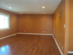
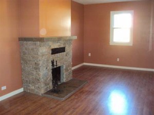
 When we bought our house, it had been newly renovated. The paint was fresh, even if it isn’t a shade I would pick myself. I don’t love it, but I could live with it, so we decided to leave it alone for a little while. As you can see in the photo on the right, most of our main living space is orange. Orange. This has become decidedly more obnoxious the longer we’ve lived in the house, so it’s time for the orange to go.
Part of our motivation comes from the fact that we recently purchased new furniture for the living room — a Pottery Barn Comfort Roll slip-covered sofa, armchair, and ottoman. It should be delivered in the next few weeks. While the Pottery Barn furniture of my dreams is light in color, that obviously would have been a really dumb move with a toddler running around. Instead, we opted for the darkest shade they have — espresso. Here is the couch: Because the furniture is so dark, we want something light for the walls. But I’ve lived with off-white walls for most of my life, so I really want some color. The master bedroom is a pleasant light mocha color, so we’re leaving it. Judah’s room, the guest room, and the guest bathroom are neutral off white, so we’re holding off on painting those, too. For now, we’re just doing the living room, kitchen, and den.
The kitchen is super orange right now.
And the den sort of looks orange in this picture, but it’s really kind of an orangey pinkish coral color.
Since we have an open floor plan, I want the colors to coordinate with each other. We’ve pretty much decided on a pale blue in the living room, light yellow in the kitchen, and light green in the den. We’re still looking at swatches and trying to make decisions about shade, which seems impossible with all of the options available to us. But I feel pretty good that we have it narrowed down to those three colors.
Basically, I’m looking for tips, shade selections, favorite paint brands — anything you can tell me about interior paint would be much appreciated. I’m hoping we can get this done without screwing up too badly the first time, so I need expert advice from my readers!


I love Olympic paint for it’s no VOC properties. I painted the nursery with it and you couldn’t even smell the paint!! If you are looking for regular paint, Behr is fabulous!! Its coverage is awesome. I would go with eggshell or satin. Eggshell looks great but is not as easy to clean as satin.
When is the painting party? ;) If you have other questions, email me!
I don’t really understand the renovator’s color choice, but I think it looked kinda cool. I can see how it would get old fast, though. My red kitchen is driving me crazy. Too red! Same with my red bedroom. I don’t know anything about painting either but I guess we’ll learn together.
I’m planning on going with a no-VOC paint. That’s as far as I’ve got.
at lowes where they have the paint color things they have little inspiration books that show some samples and examples of colors that go together nicely. i’m horrible at picking things, so i’d go that route. lol
Since your walls are such intense shades, a primer like Kilz brand might be a good idea. You can get some paints with primer in them, but I’ve found they need two coats anyway. The Kilz primer does the job and is cheaper than painting 2+ thick coats of paint.
Last summer I painted my bedroom. I have potterybarn-esque bedroom furniture and a pb duvet. I was researching paint ideas and how to pick the perfect color because I am a terrible decision maker. I came across this blog that suggested using colors that stores like Pottery Barn and Restoration Hardware use in their catalogs. They do all the work, matching the colors with furniture finishes and fabrics. So I went to the closest Benjamin Moore, found the paint sample card, brought it to a hardware store, and had them match the color for me. My walls are affordably wedgewood gray and I feel like I’m walking into a PB catalog whenever I walk into my bedroom. Might not work for everyone, but it worked for me!
http://www.potterybarn.com/shop/accessories-decor/hardware/hardware-paint/?cm_src=productsearch
http://www.restorationhardware.com/catalog/category/products.jsp?categoryId=cat1017001
Hope this helps!
Awesome tip, Kristy. Thanks! I’m having such a hard time narrowing shades. Maybe this will give me a starting point.
I did the same thing in my bathroom…bought a shower curtain I loved and brought the picture in and asked them to color-match the wall color in the picture…turned out perfect.
As far as paint, I swear by Sherwin Williams Duration Home Interior Matte finish. Fair warning – this paint isn’t cheap, but after using brands from Home Depot and Menards on my kitchen, bedrooms & bathrooms – I finally splurged on SW Matte for my Living/Dining rooms and it made a world of difference on the final finish. I love that it’s not too shiny & glossy, resists fingers smears and it cleans well.
If you decide to go with Sherwin Williams, hunt around the web for coupons….I know they have some in the Entertainment book if you or a family member/friend have one of those (or ask for them on craigslist – I’ve given plenty of my book’s coupons away for things I don’t use).
Here’s the current one for February 2012…I think they do one every month:
http://sherwinwilliamscoupons.co/wp-content/uploads/2012/02/Sherwin-Williams-coupons-February-20121.pdf
Here’s a site with some good tips on choosing color & getting the painting started: http://mycolortopia.com/blog/nicole-balch. Nicole runs http://www.makingitlovely.com, which is a fabulous shelter blog.
Our living room is a very-very pale blue and our hallway is the color of a pale person (like me). Our bedroom is a very pale mint green. They work fabulously together. We got our colors at Menards, but I think the green was originally the formula for a Martha Stewart color called garden can or something like that.
Do you have other items picked for the room? You should pick enerything, even if you don’t purchase it yet. You do not want to paint a room and then pick out the rugs, art, accessories to match the color of the paint. There are hundreds of paint colors and dozens of shades of what you want.
Please please pick out the paint color last. Once you pick your accessories, rugs, art the paint color will almost pick itself!
We actually repainted our entire house when we moved in. It was a chore, but completely worth it. My advice: Painter’s tape is your best friend, and don’t be tempted to cheap out on trim brushes.
As far as colors go, we painted our main living area with Olympic’s Simply Elegant (C53-1). It’s a really light blue color, and I love it. Very cheery. We painted our kitchen in Olympic Flax (A14-2), which is a nice buttery yellow color.
When you’re narrowing in on colors, I really recommend getting a little sample container, painting swatches on a couple of different walls and living with it for a couple of days. That way you can see how the color looks in different light throughout the day. Though we thought we were painting our bedroom grey, it actually looks lavender in the afternoon.
It’s funny that I ran across this today because I was just discussing painting with my boyfriend. We just moved into our new house on the 1st of the year and we have a guest bedroom and office that needs to be painted desperately! We did paint our den area already (it was first to be painted) and we taped off a square, primed it and painted it so we could look at it for a few days to make sure it wasn’t going to get annoying. It’s still the same color so I’d do a test area like that. GOOD LUCK :)
All of the other commenters had great tips. I would add to look at Young House Love ‘s blog. They have lots of great painting tips and ways they choose colors. They have a daughter a little older than Judah and are very conscious of safety and durability for little ones.
My favorite go to color for family spaces is Sherwin Williams Killim Beige. I gave found it goes with everything, not too green, yellow, pink etc. I recommend getting Home Depot to color match in Behr paint.
There are some great tips here! The other thought that I had was to be open to inspiration from everywhere. For our living room, I had a hard time choosing a paint color. One day while reading a book I realized I loved the color combination on the cover, a light teal green-blue with cream and red accents. (It’s this book, if you’re interested: http://www.amazon.com/Homemade-Life-Stories-Recipes-Kitchen/dp/1416551050/ref=sr_1_4?ie=UTF8&qid=1330194311&sr=8-4). I took the book to Lowe’s and they were great about finding the elusive light teal green-blue. Our trim is cream, and our accents are brown and red. So if you find a color that you love somewhere besides a paint swatch, don’t be afraid to bring it in!
We don’t exactly have an open floor plan, but you can see into most of the other rooms in the downstairs. We’ve decided to use the same cream color of paint for the trim in all these rooms, even if the main colors are different. Also, I am using the one of the accent colors from the living room as the main color in the kitchen.
I wholeheartedly second the painter’s tape and good brushes comments also. Painter’s tape can be a pain to put up and take down, but it makes everything neater, and good brushes make the job much easier and makes your walls look better. Also, don’t put those paint cans too far out of reach once you’ve finished–I noticed lots of little areas that needed touching up the day after I stowed them away.